Tuesday, December 17, 2013

Visual Techniques


Artwork by Retna.

Balance. Asymmetry. Irregularity. Fragmentation. Intricacy. Exaggeration. Spontaneity. Activeness. Boldness. Neutrality. Variation. Distortion. Flatness. Juxtaposition. Sequentiality. Sharpness. Episodicity.  


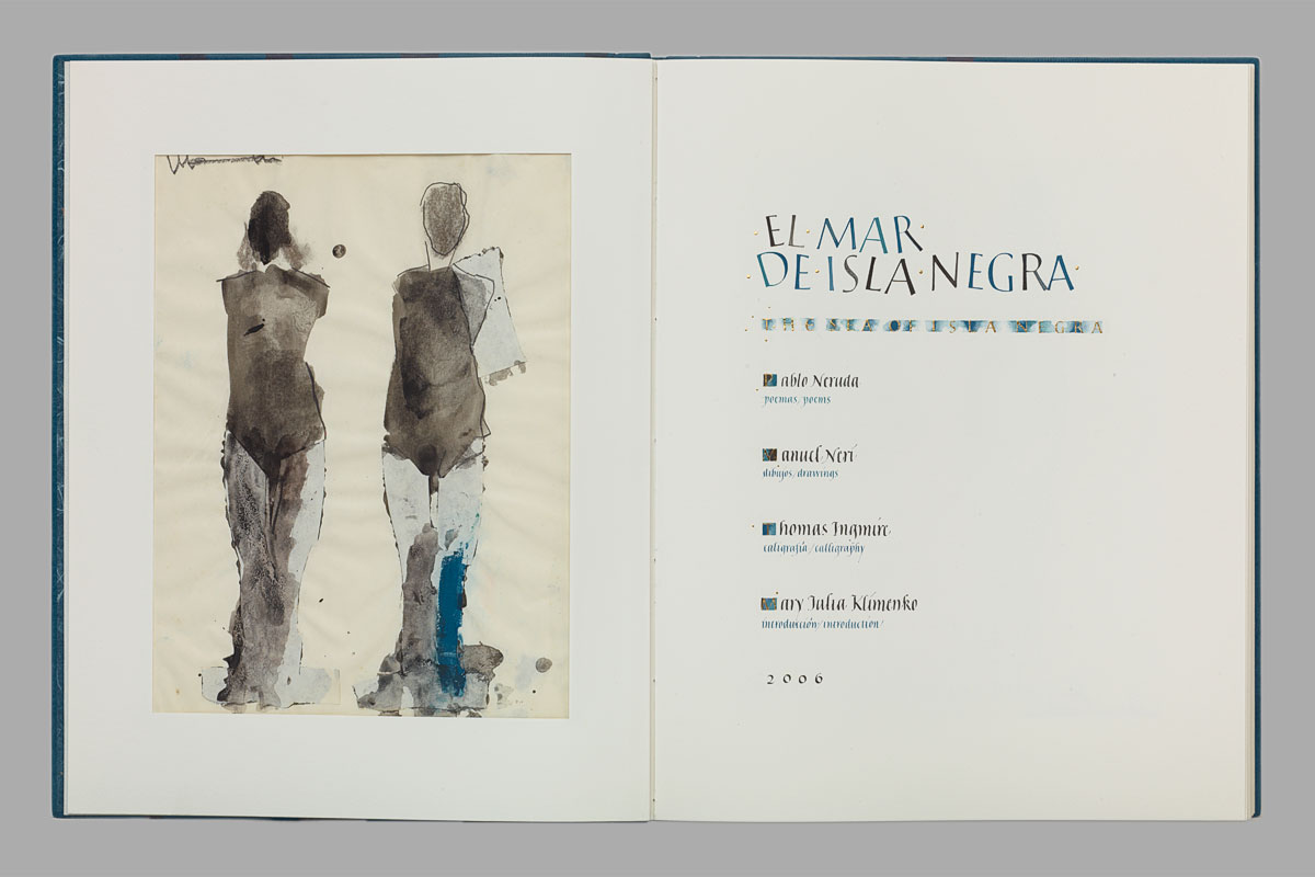
Photo from Thomas Ingmire & Manuel Neri's project. 

Visual techniques applied to both facing pages as seen above:

Unbalanced. Asymmetry. Regularity. Fragmentation. Economy. Understatement. Predictability. Stasis. Subtlety. Accent. Transparency. Consistency. Accuracy. Depth. Juxtaposition. Sequentially. Diffusion. Repetition. 

-

The first visual technique that is communicated between these two examples are boldness versus subtlety, or neutrality. The contrast created by the close proximity of Retna's artwork is eye catching, while the use of negative space in Thomas Ingmire's book work is empty, and less active. The action in the first piece might make it seem more interesting, but there is a depth in the second that is absent from the other. The details and need for close examination of the book invites a viewer in a different way than the first. I find similarities between the left page of the book and the first example here, in that they are both irregular in technique, and therefore intriguing. The only difference is singularity versus juxtaposition, where the book work has two figures, and the first example has an episodic repetition of foreign characters.


Wednesday, December 11, 2013

Contrast

Effective Use of Contrast


Design by Luca Barcellona.

In this promotional design by Luca Barcellona, a good use of contrast is used with his gold lettering against black background. At a glance, it is a simple white on black design that provides visual contrast for the letter's readability. This example stood out because of the design work within the background. The black background contains multiple designs and logos, and typography that is displayed subtly. The highlighted message now applies to the content in the background, which is poorly contrasted — purposefully and effectively. Layers of design, layout, and lettering exemplifying an effective use of contrast. The black background can be seen to provide context and make the gold lettering even lighter in tone than it may seem against a white background.


Poor Use of Contrast


Unknown designer.

In this image, we see a yellow sign, with a black line within providing a clear contrasting border. The contrast in yellow and black catches one's eye to read the message in the center, however, in this example white text on a yellow background shows poor use of contrast to deliver a message. If you were to drive past this sign, you would notice the sign and not the intended message of warning. White and yellow are harmonious colors because they are generally light, but they are terrible when used for legibility or contrast because they are of similar tones. These two colors lack any type of "pop out" effect that the black lines provide.


Wednesday, December 4, 2013

Design Success and Failure & Syntactical Guidelines

This is a screenshot taken from www.google.com. Although it only features basic elements within its design, the simplicity adds to its functionality. Google is today's most talked about search engine and has even become a verb: "Google that" meaning to search that on Google. If you visit www.google.com, you intend on searching and finding something out on the Internet. This makes the landing page convenient, as there are no obstructions like ads, or flashy imagery. All of Google's other features are contained within the top bar, and kept minimal. The layout design is symmetrical, well balanced and therefore conveying the message of stability and trust. This design is successful because it establishes trust, helps you search what you intended to without obstruction, and is easy to understand.


In comparison to the previous, this is a screenshot from the landing page of www.yahoo.com. Also originating as a search engine website, this landing page is full of clutter. The design is asymmetrical, with a stressful layout containing lots of information. If you had something in mind to search and discover, you would easily get distracted by their headlining news, trending topics, advertisements, and various external linking sites viewed on the left navigation column. This design example fails at successfully providing you a convenient search system, simply because it bombards you with information.

Saturday, November 2, 2013

Tone and Color


How TONE is operating

In this poster artwork by Ken Davis, tone is operating by contrasting and pulling our eyes towards the hierarchy of important elements in the design. The dark brown text against the light blue background catches our eyes first, as we move both above and below it afterwards to gain more information on "High Sierra". Interestingly enough, the most detailed area using tone, the pinecones on the bottom right, does not immediately grab our attention. The lack of contrast, however detailed the area may be, means that it just blends into the background.

How TONE is interacting

The way in which tone is interacting in this poster gives a sense of movement across the page. The dimensional shape given to the blue background swirls across the poster, with the dark brown details wisping off as highlights. The light blue background found immediately between the dark brown text and the dark blue drop shadow it has, serve as a highlight on the right side of the text. This gives the center text a more three dimensional appearance. The detailed pinecones on the bottom are given form and three dimensionality through the use of shadows.

How COLOR is operating

The usage of earth tone colors relates to what the poster is about, an outdoors backpacking roadtrip. The brown colors remind of us dirt and earth, while the blue colors remind us of open sky. This natural color palette is complimented by organic dark brown elements underlining and surrounding the text. We get an overall sense of neutrality.

How COLOR is interacting

The neutral brown background is calm and earth toned, extremely subdued when paired with the blues in the artwork. This operates to give us an impression of what is brought to the foreground (important) & what is in the background (subdued information). As mentioned above, the highlights found on the main text's letters are the same light blue found throughout the poster. Placed on the right side of the text, and using the brightest color on the design, our eyes see this as a white highlight of shine, making the letters three dimensional.

Photo from: http://coyoteandthunder.com/2012/08/27/juniper-ridges-high-sierra-summer-camp/

Wednesday, October 23, 2013

Web Design


Lines

This website design uses simple lines to establish a clear division of sections. Directly underneath the menu we see a long line that separates the menu space from the banner. Beneath this the layout switches to a 2 column design, with each new section displaying a new dividing line. Although there are many buttons and photographs, the repetition of dividing lines, and sub-header lines, establish a clear closure between each area of the website. The sides of the layout even show vertical lines, giving the website content a border.

www.hieroglyphics.com


Dots

The design of this website includes lots of sketch-like drawings in the background, as well as script text which all conveys the feeling of hand-made. One of the few elements of this screenshot is the line of dots on the left side of the page. Their equidistant placement lets us know that they are separate, and have unique functions, but are in-fact all related. Typically, the constant repetition of dots in a close proximity indicate social website buttons. Other times they are squares, or default icons, but they follow the rule of close proximity placement for the establishment of similarity.

http://www.mezcalbuenviaje.com


Shapes

Soundcloud is a music hosting and streaming website that recently revamped their entire look. In this screen shot, I lowered the top navigation window to display even more content over one of their artist pages. The use of shapes is critical to establish separation of areas, as in the actual dark-background drop down window that creates a rectangular shape that contrasts the rest of the white-background site. Each track has a soundwave shape that clearly indicates where the actual music is & can be played from. Each "player" also has a highly recognized play button above the soundwave. The usage of "boxes" or rectangles" for 'action buttons' are found throughout, on the right hand column for the Soundcloud app download links, and the interaction of user found on the left.

www.soundcloud.com

Wednesday, October 16, 2013

Puzzle Playground


This first scan is my friend's result of the puzzle. She said she looked for a continuous heart that went over and under, and her eyes moved across the diagram. This is an applied pattern finding technique. If you look at any heart it most likely is fully under or over another heart. If that pattern is broken and it overlaps then it is one of the "tangled" hearts. 


This was my sheet, I went for a similar approach for looking at each heart for the "over and under" section to see if it is tangled, rather than fully above or under. I only found 3 however with this similar approach. One of the main differences between our puzzle solving technique was I searched for particular points (over and under) while my friend followed the entire heart shape with her eyes. The heart I missed (top right) is in a more compact & dense area.


My friend's scan shows where she took the basic shape that was given and flipped it once for each time it fit. That's where the first "2" comes from, she then flipped the given shape to fit the other end into each point of the yellow shape and flipped or mirrored it again. She came out with a total of 16. She imagined a different viewpoint for each placement that fit.


I started off by placing lines into the given shape, thinking it would be easier to break up and see how it fits. I placed the square area into each 4 corners of the yellow shape and did the similar process of mirroring it to the other side. But I struggled with applying the other end of the given shape (the rectangle) towards the yellow shape. Once I did figure that out, I forgot to mirror it per each side and ended up with 12 (4 short, one mirrored shape per side..)

Wednesday, October 2, 2013

Visual Perception 1 / Top-Down Visual Processing


The features of this BART map include a clear separation of a 'blue area', a distinctly different grayed-out area, and an "X" like shape splattered over the entire image. The separation of land versus water is distinguished with color, more explicitly noticed on the land which has bounded areas of green and gray. These are the patterns we see on the map, we also can clearly see a divide between the terrain map which is dull, versus the bright eye-catching route of the BART lines. Finally for the objects that we notice, although almost minute on this map, there are the different BART trains, defined by color. The blue immediately calls our attention and is identified as water. We also notice the symbols used for information, a prime example being the parking symbol which repeats throughout the map.